Enter the password to view this case study.
Flipkart · Shopping Funnel · 2020–2022
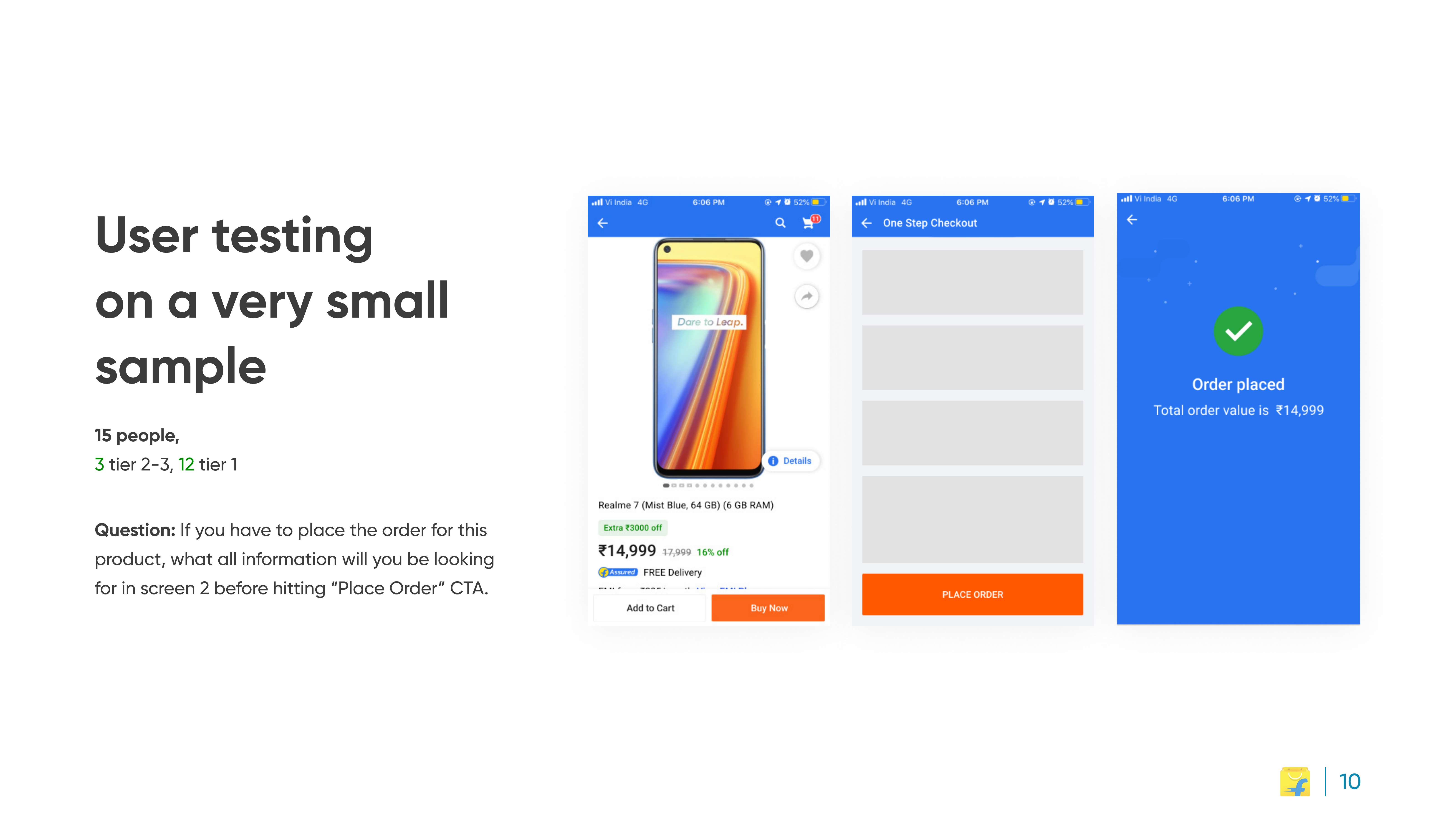
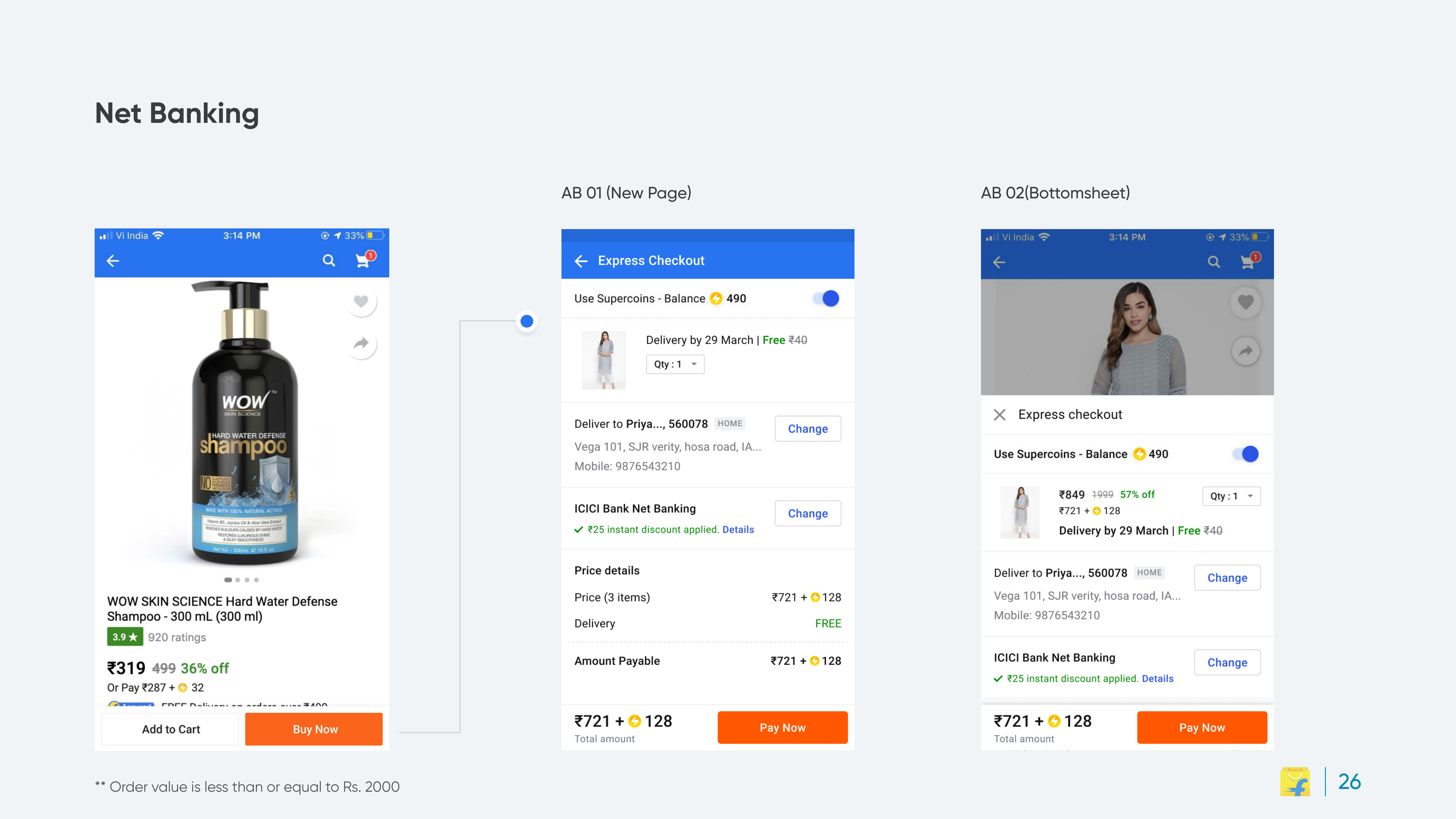
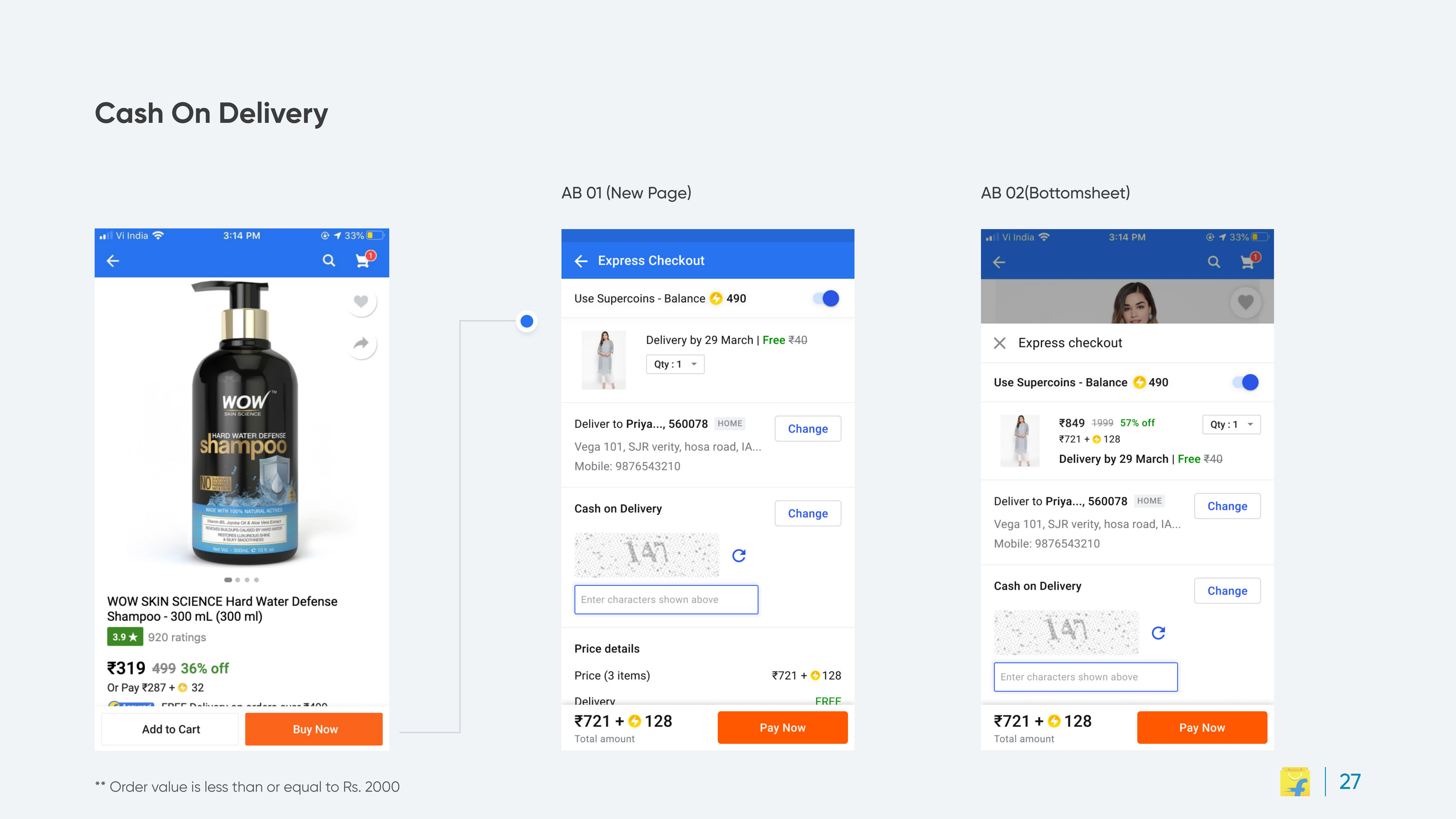
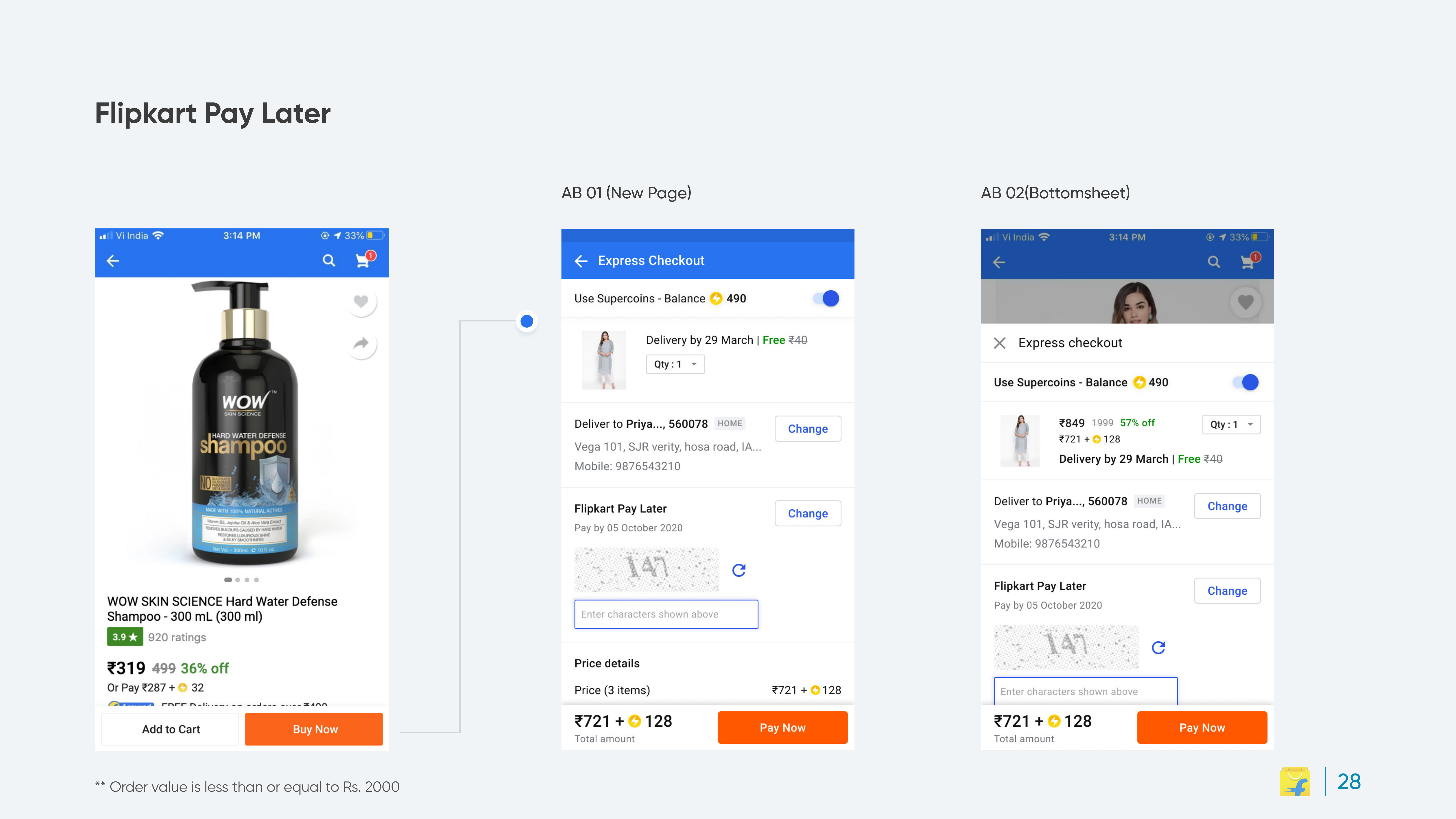
Flipkart's multi-step checkout was one of the platform's highest abandonment points. I redesigned checkout as a single-page experience, address, payment and review compressed into one scannable surface.
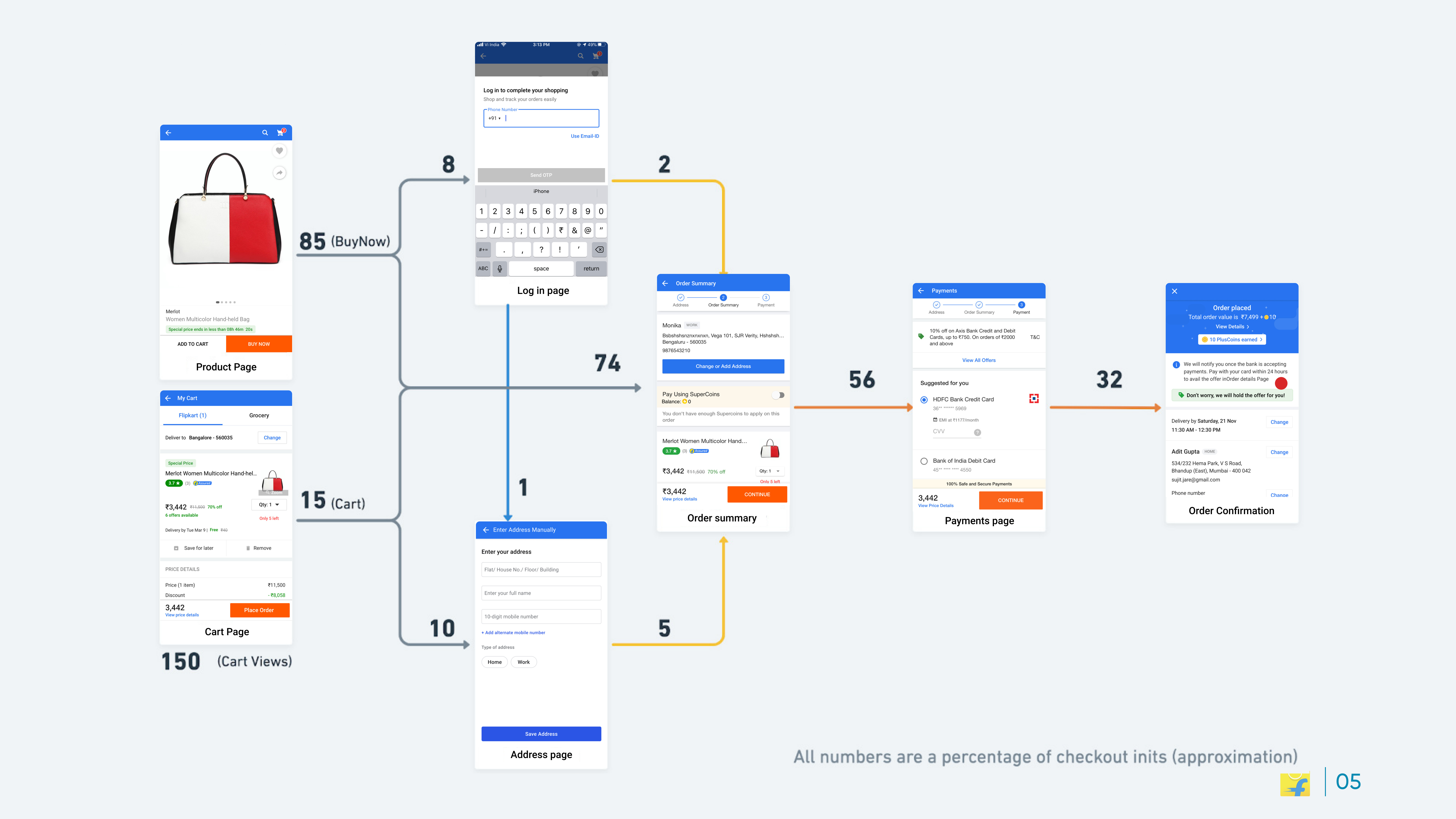
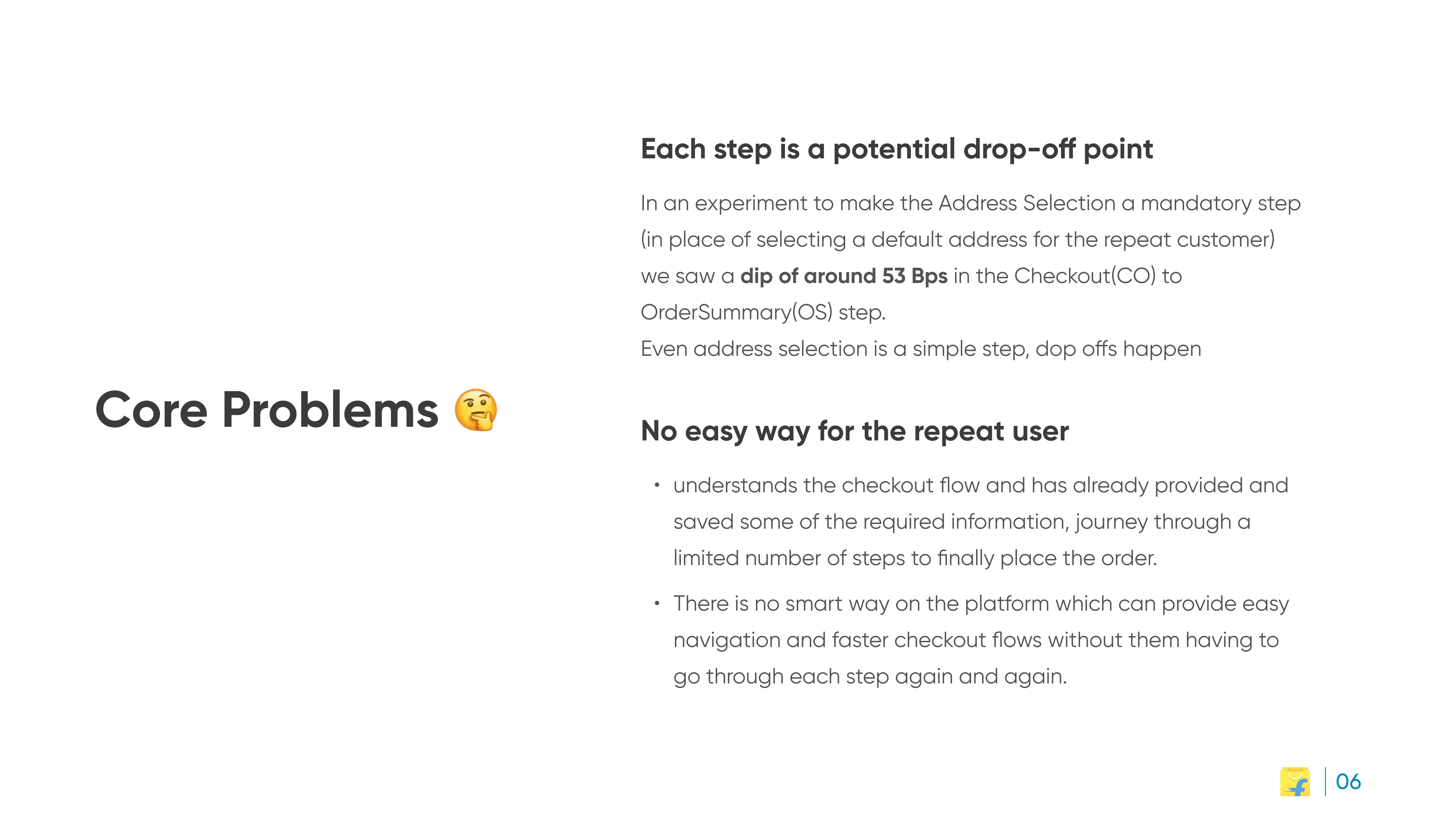
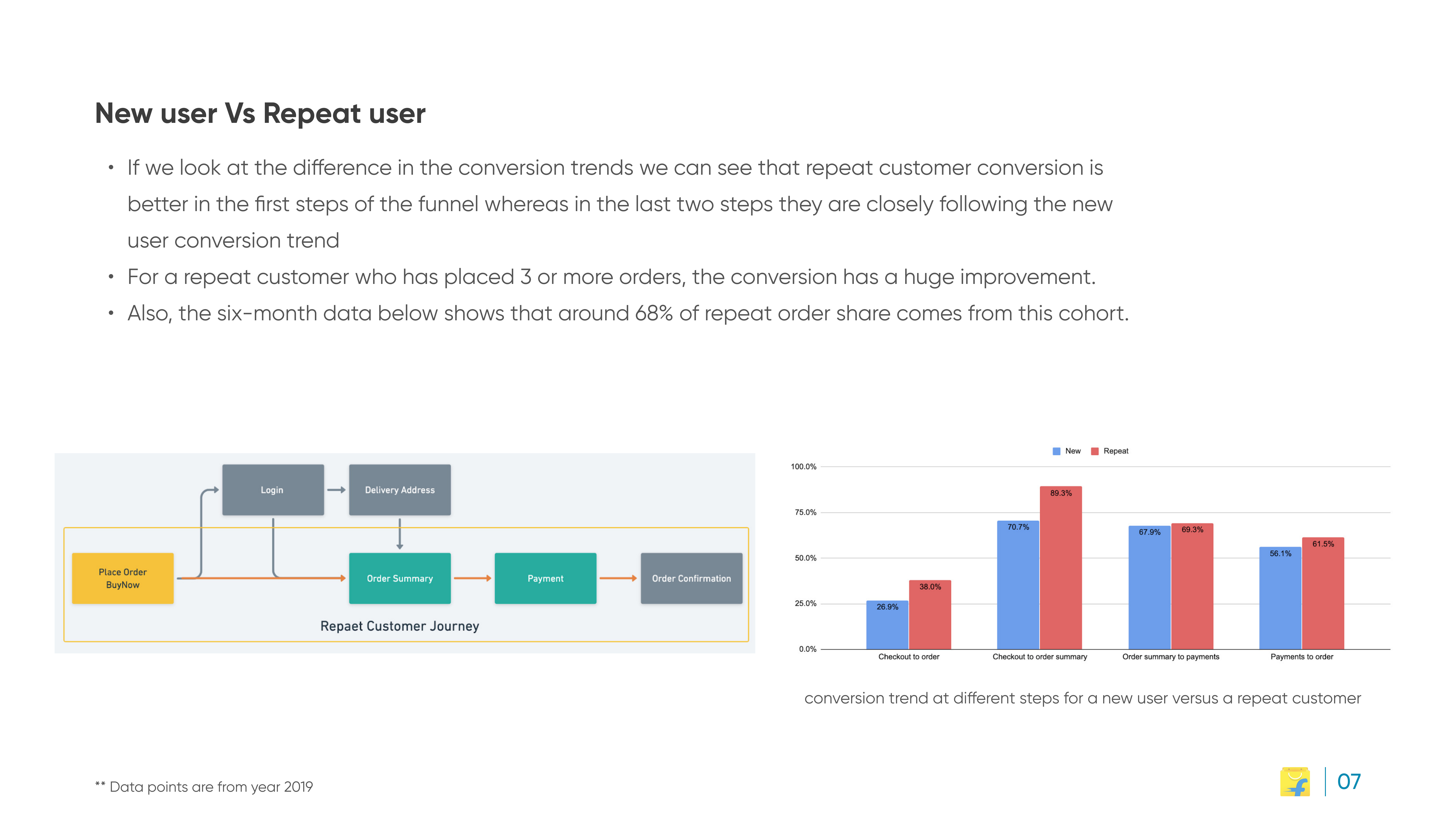
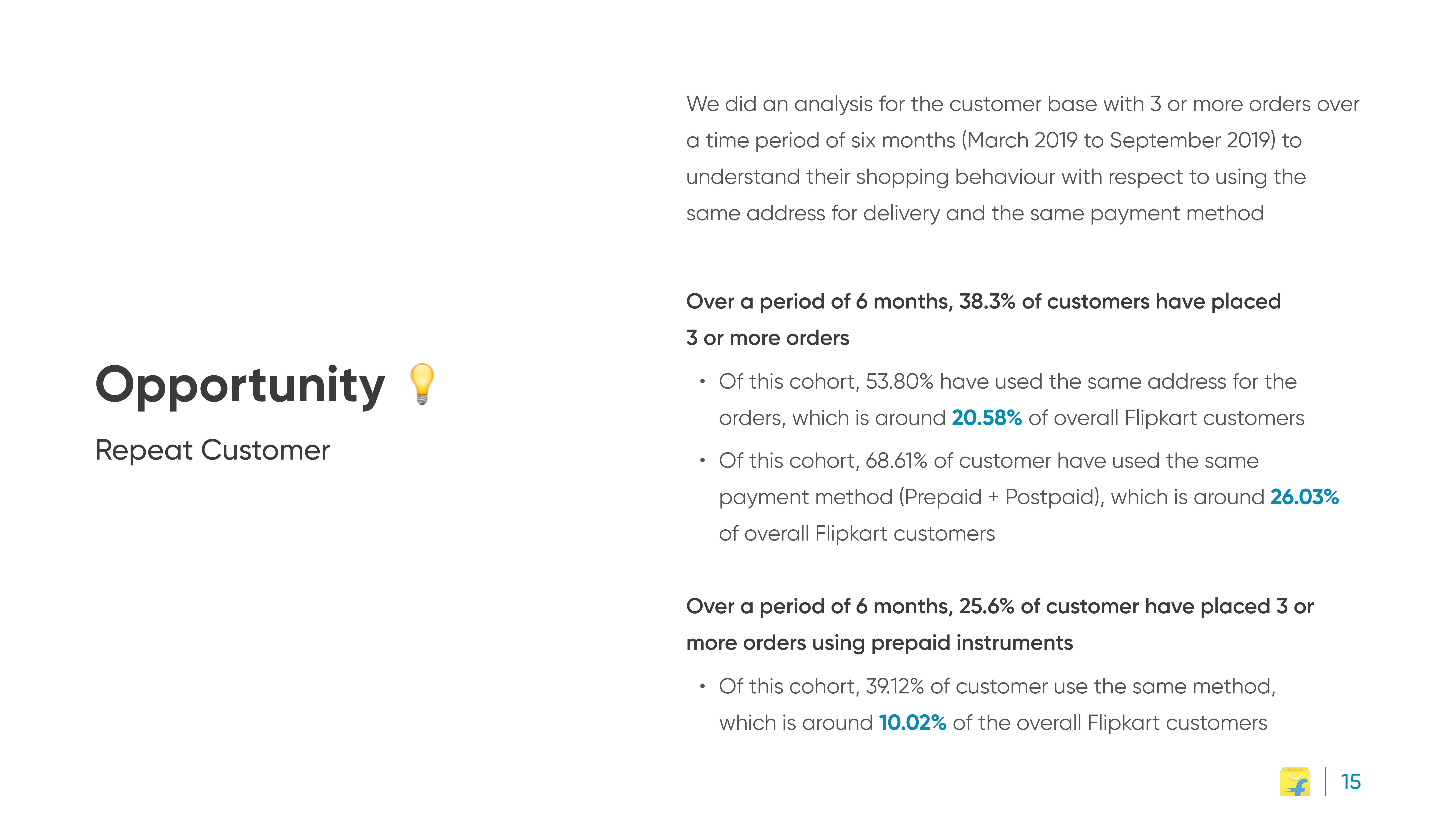
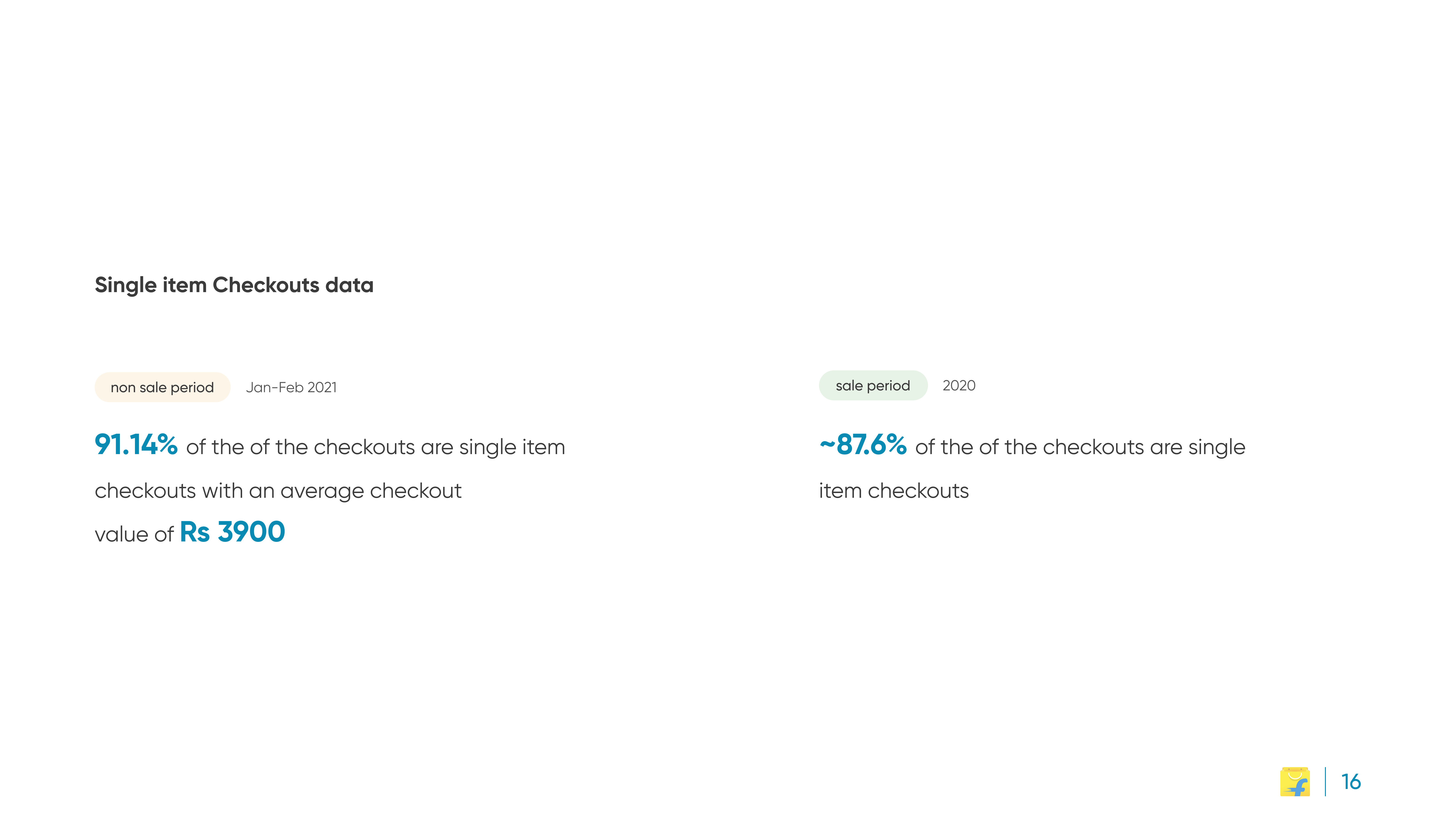
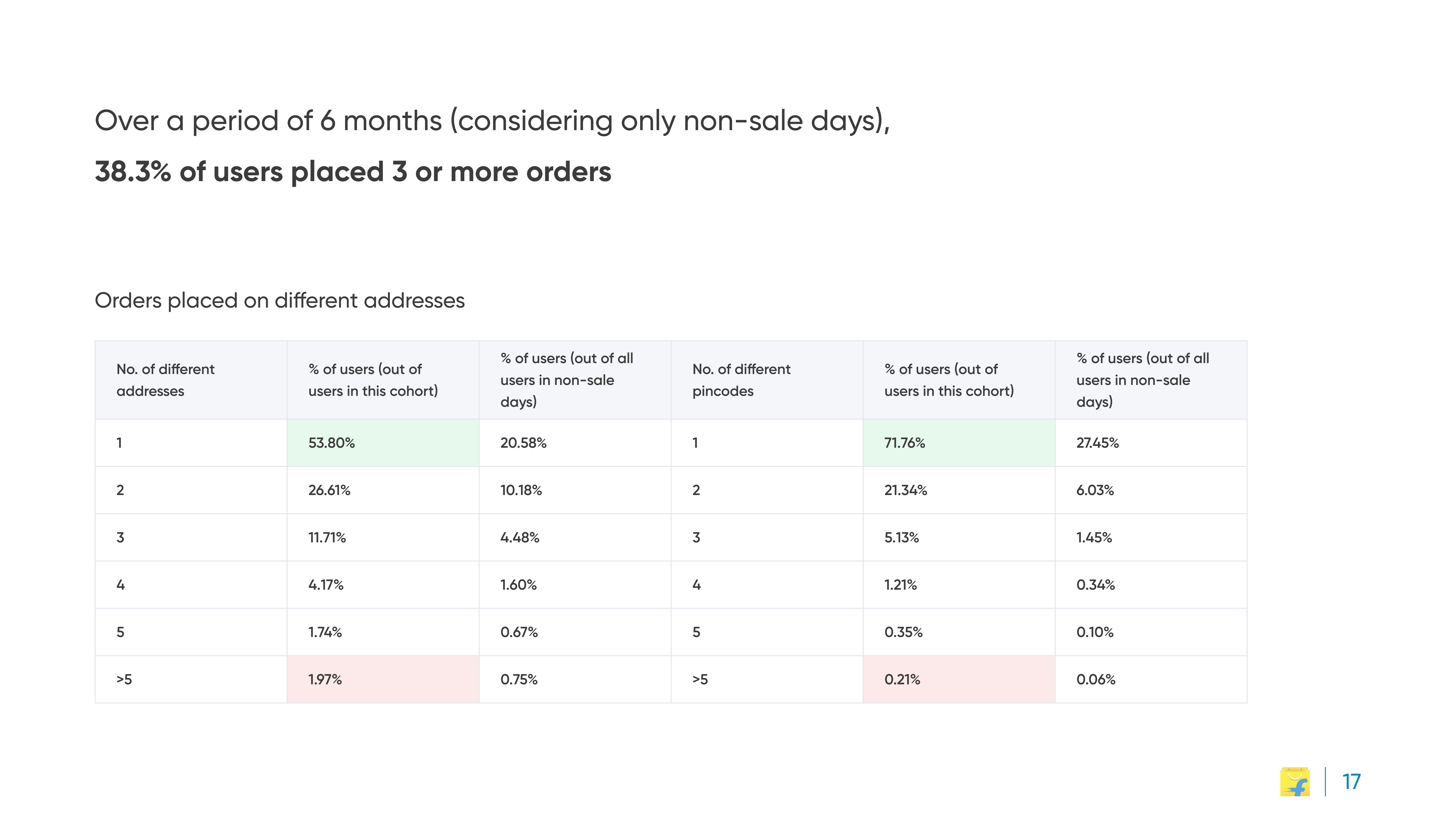
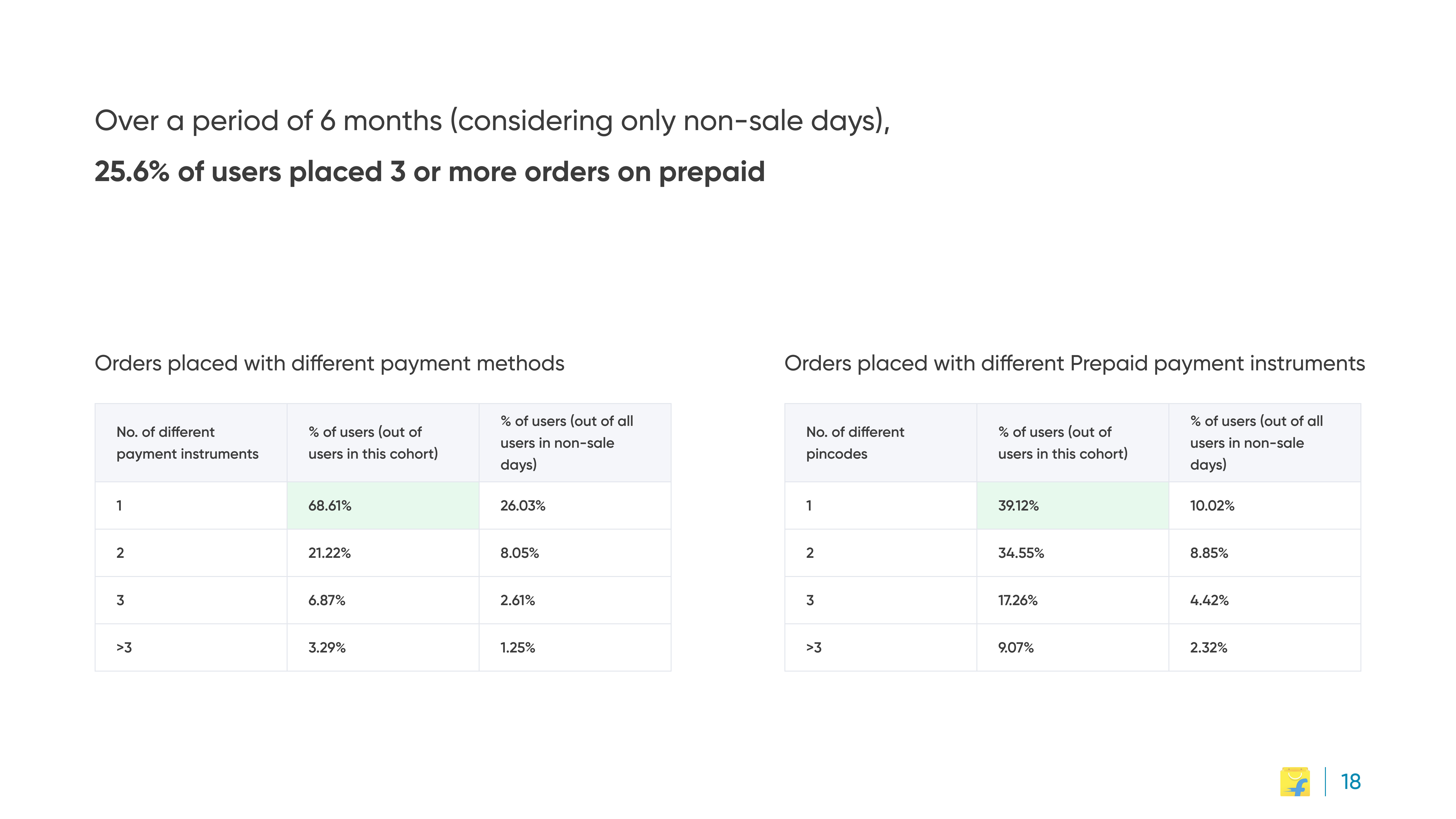
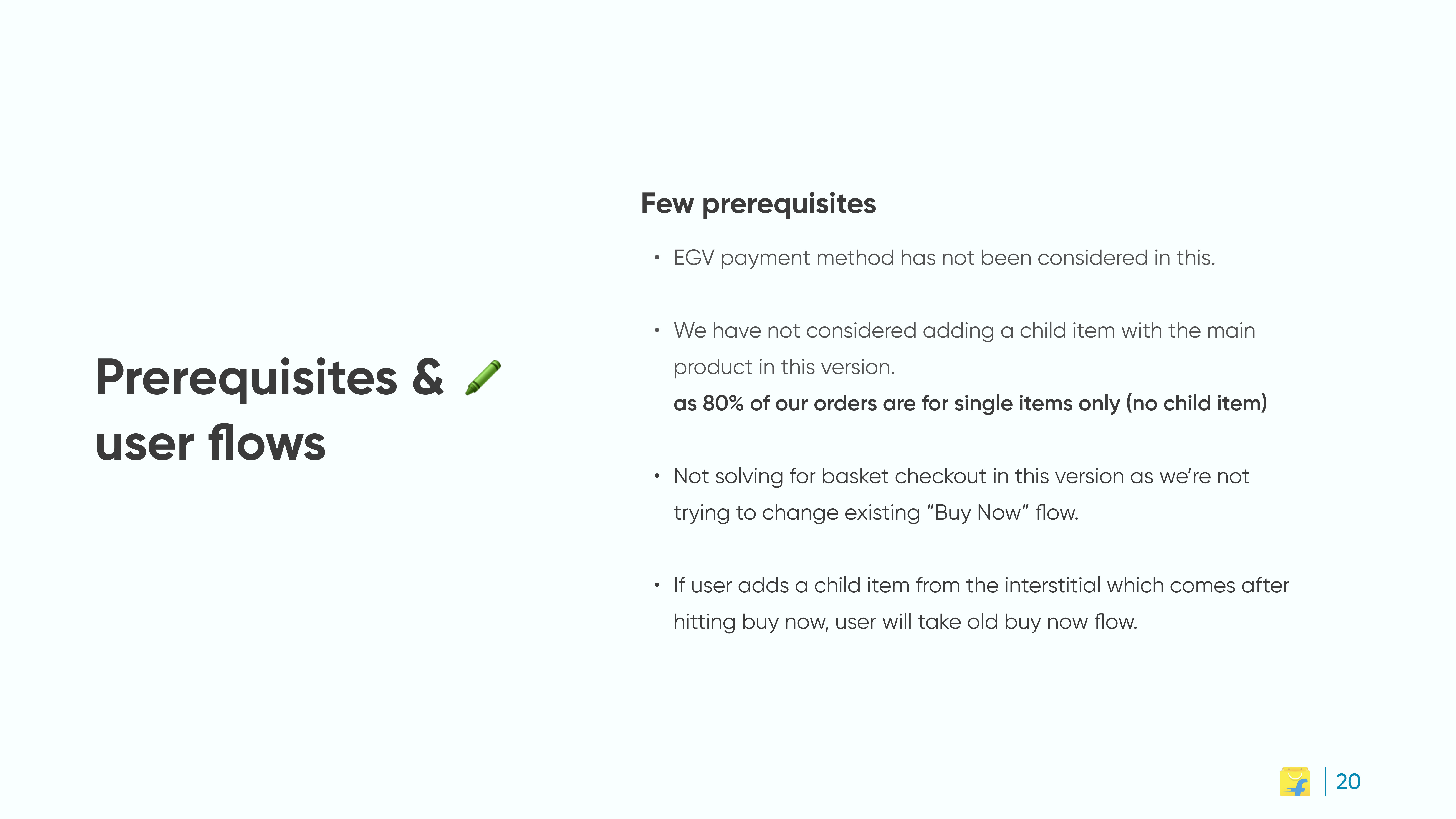
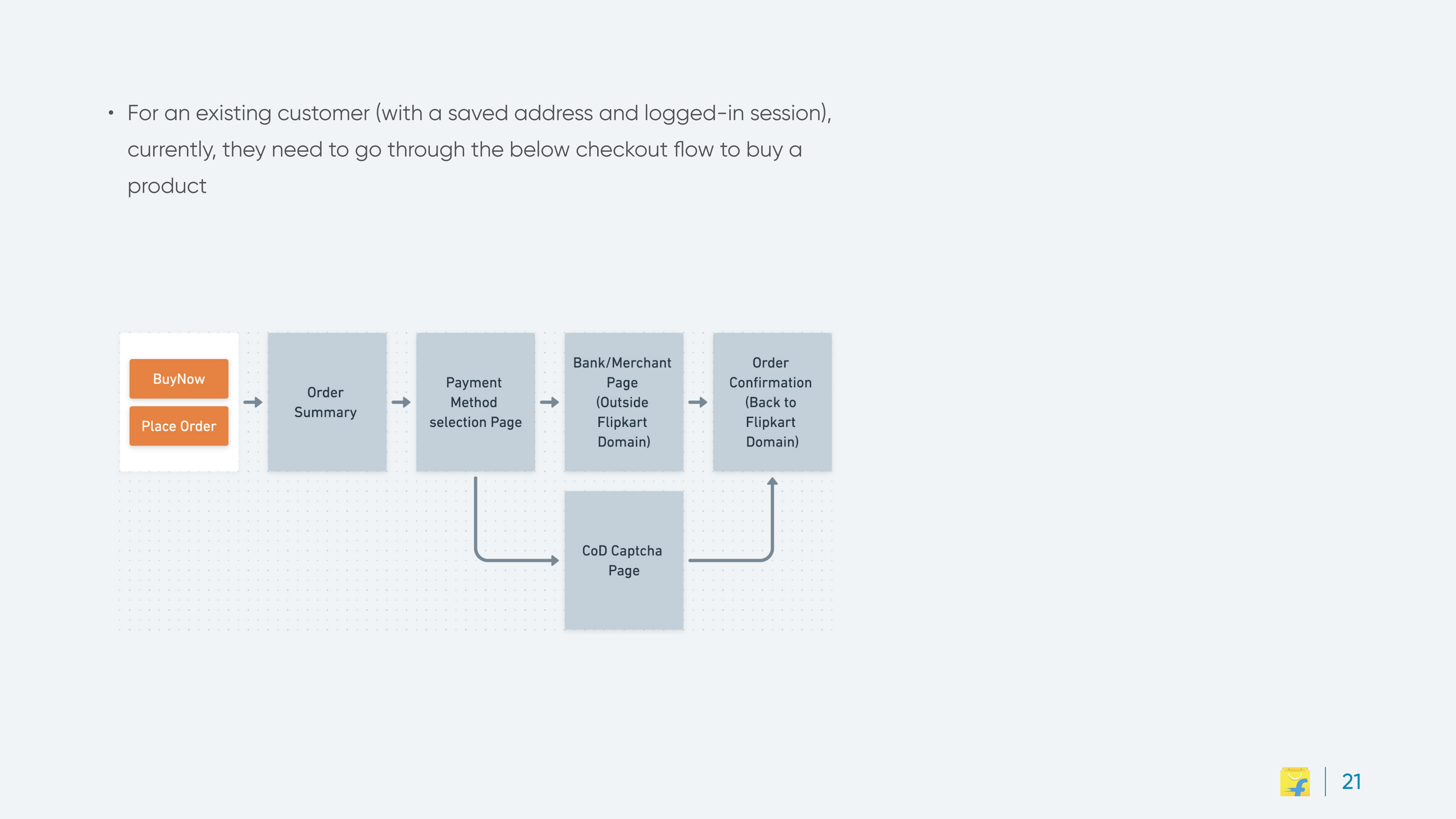
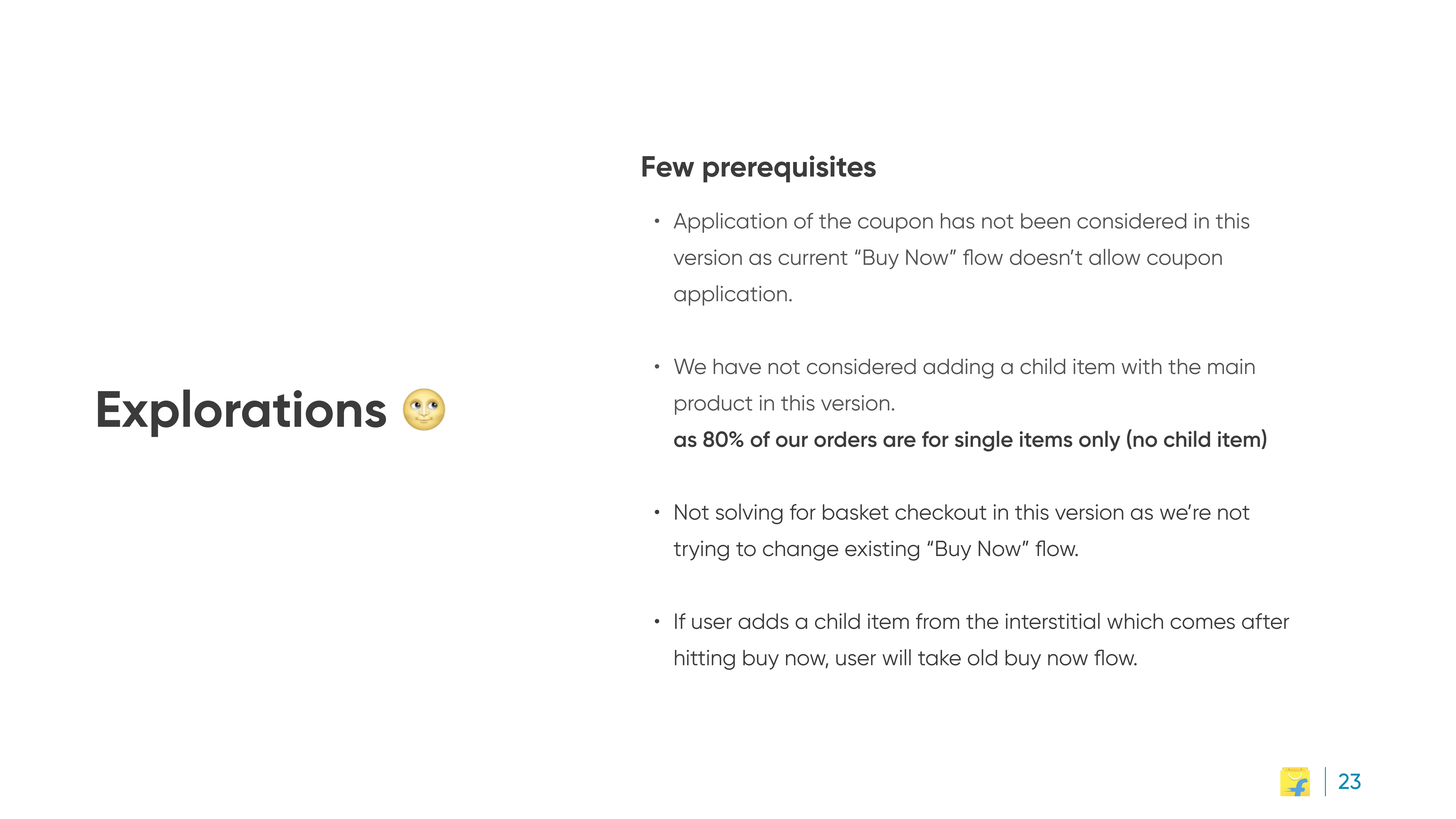
The problem: Flipkart's multi-step checkout was one of the platform's highest abandonment points, and the data was pointed: over 91% of checkouts were single-item, and repeat customers overwhelmingly reused the same address and payment method. Most people paid a five-step tax for a one-decision purchase.
My role: product designer; redesigned checkout as a single-page experience for the returning-customer cohort.
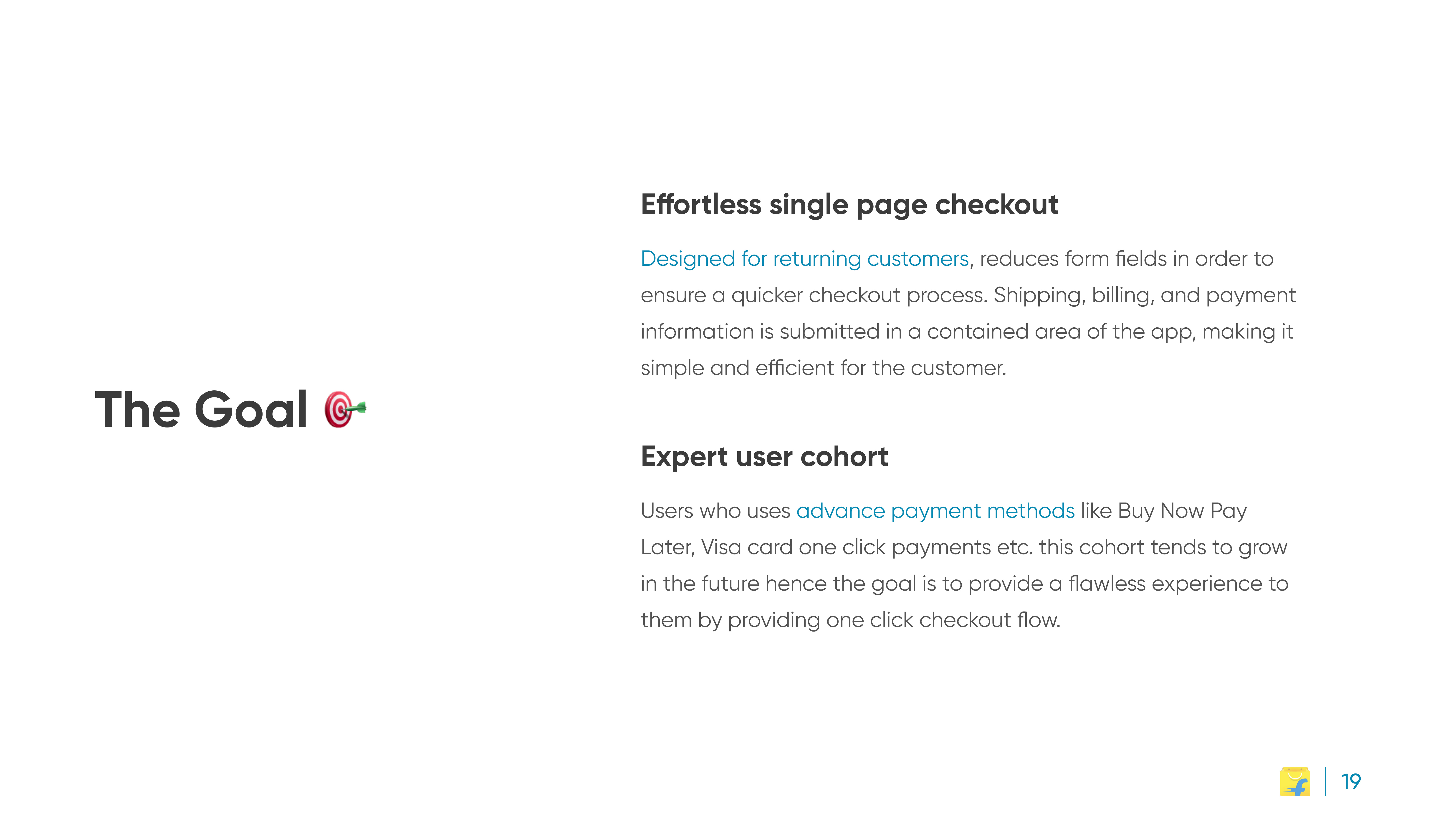
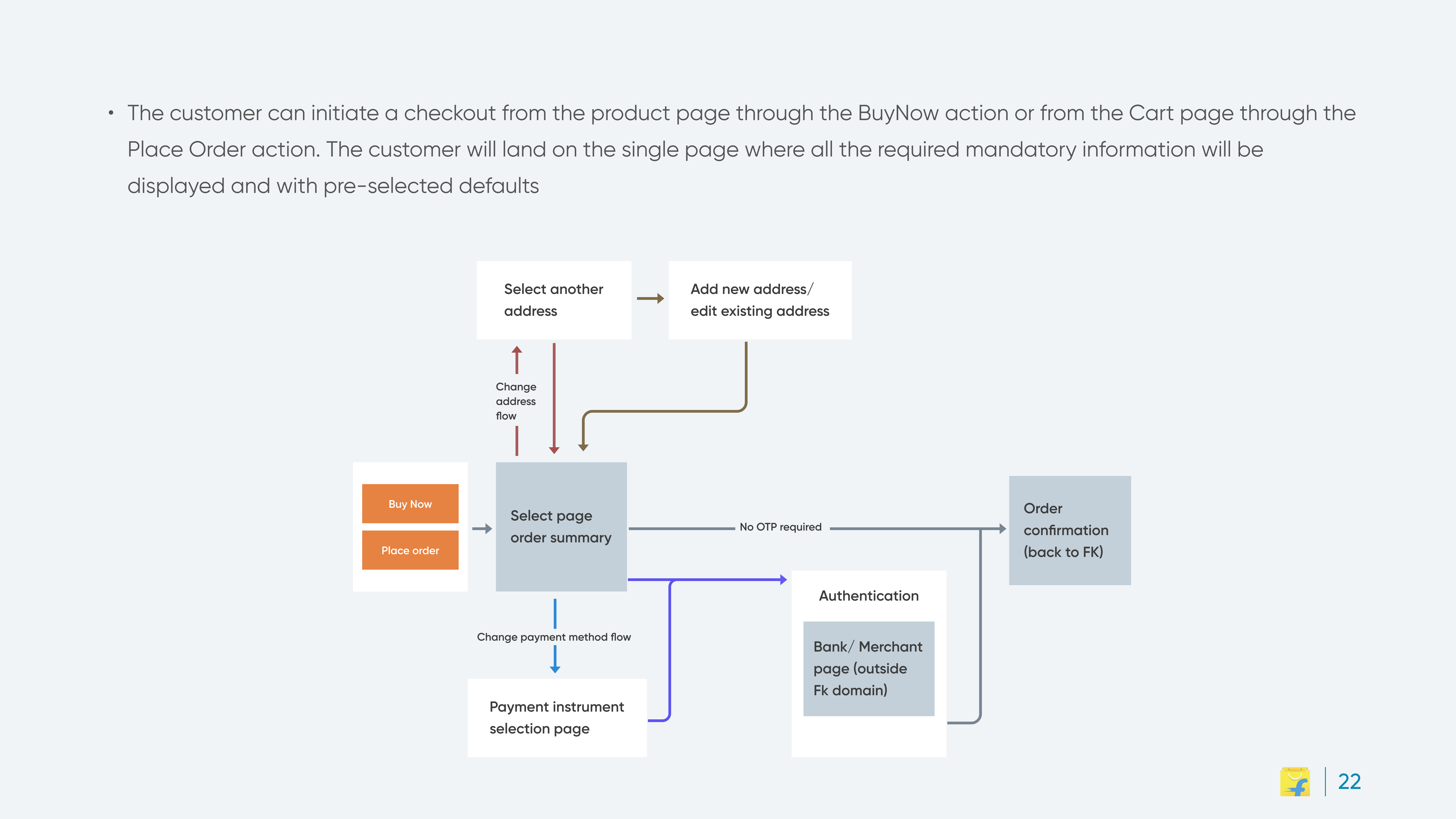
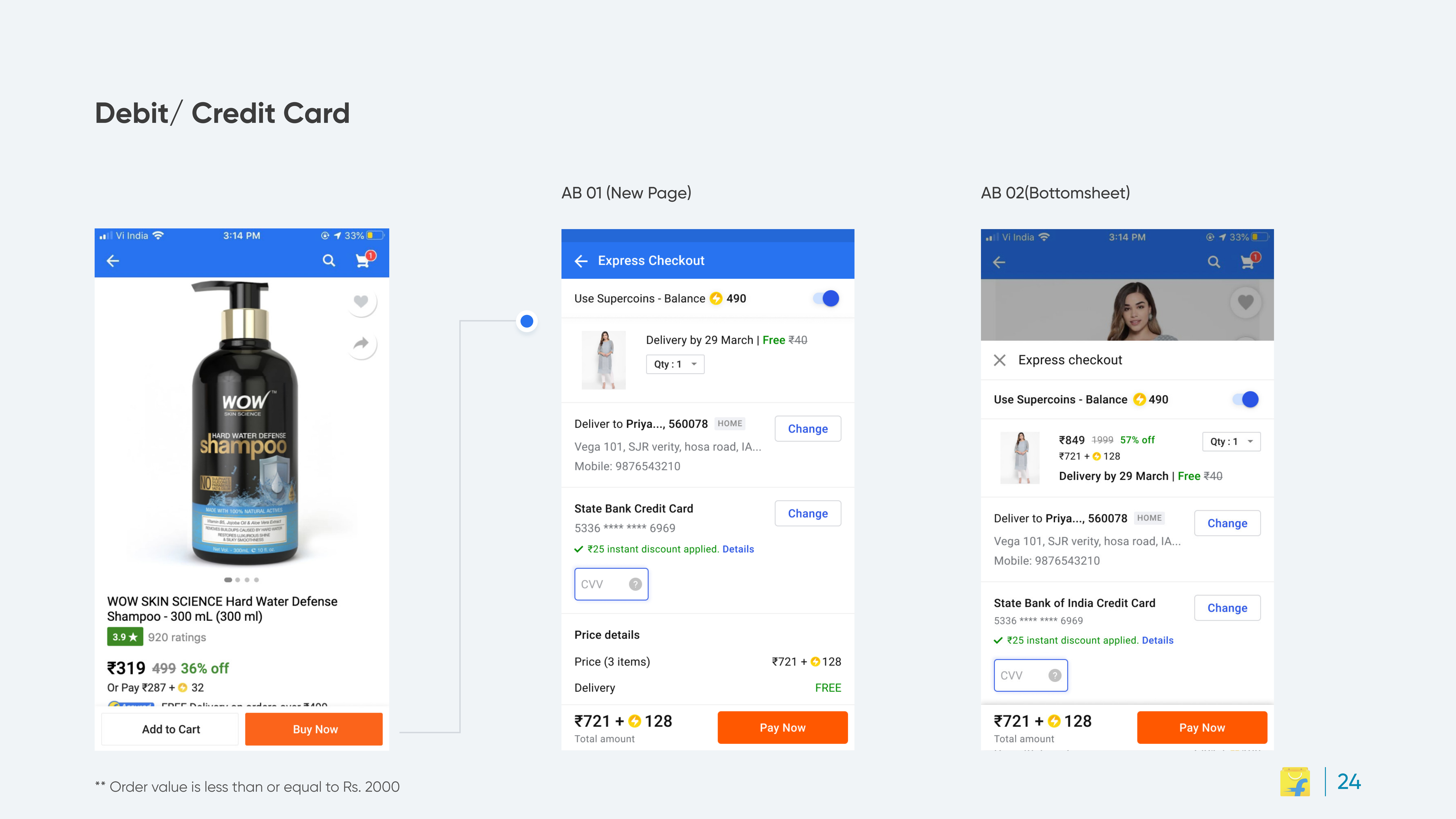
One page, progressive disclosure, address, payment and review visible at once; complexity available on demand.
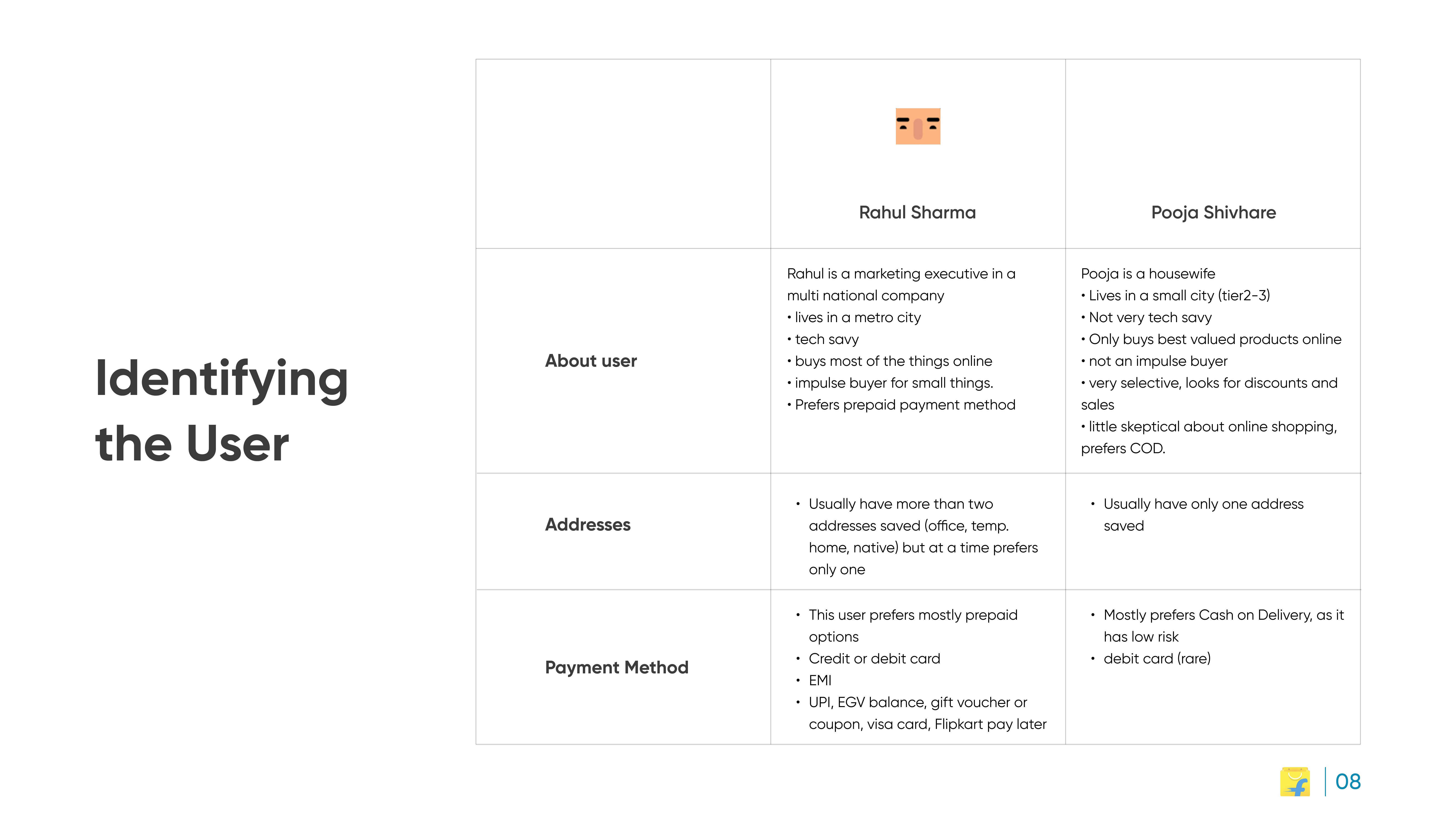
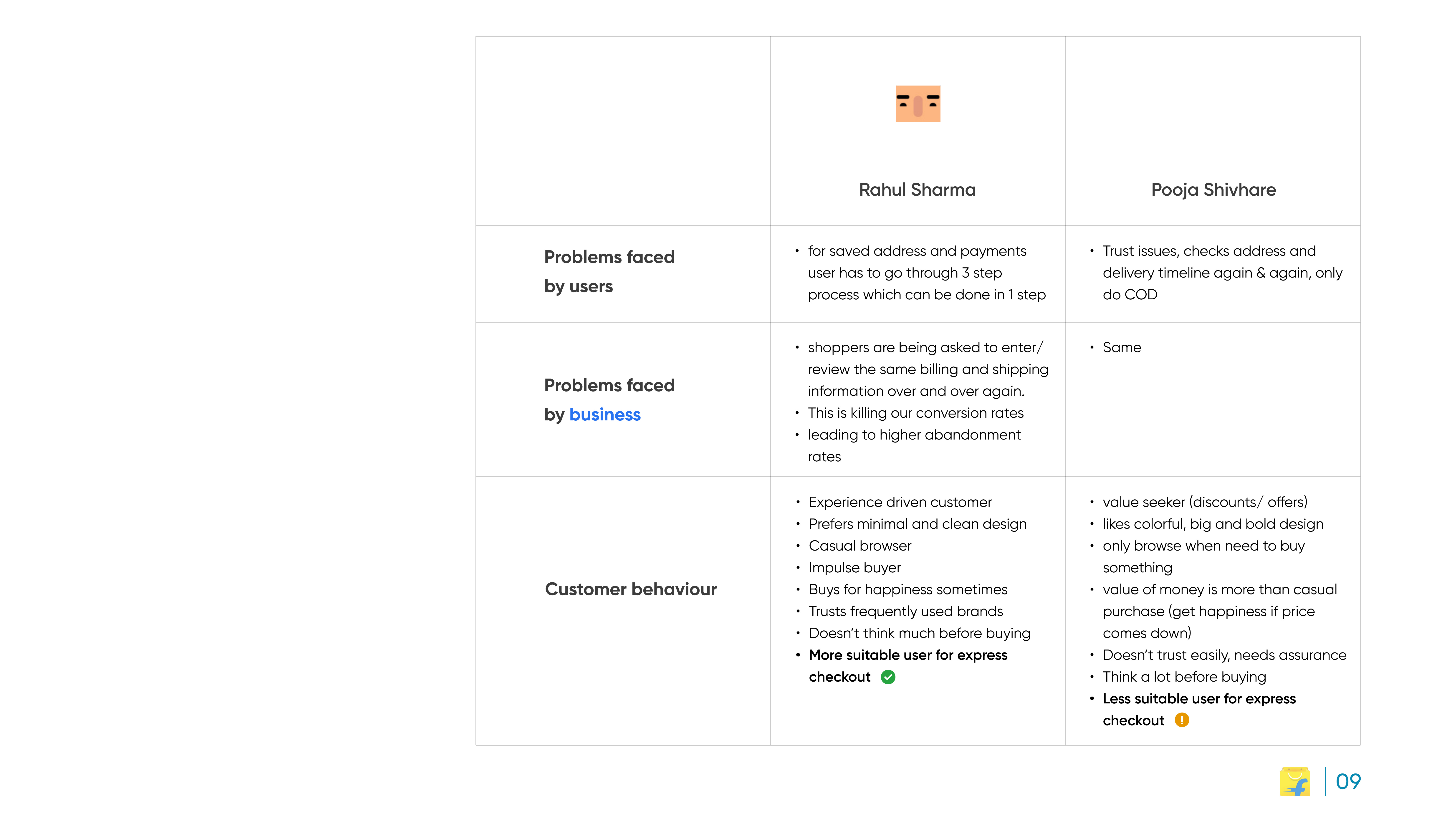
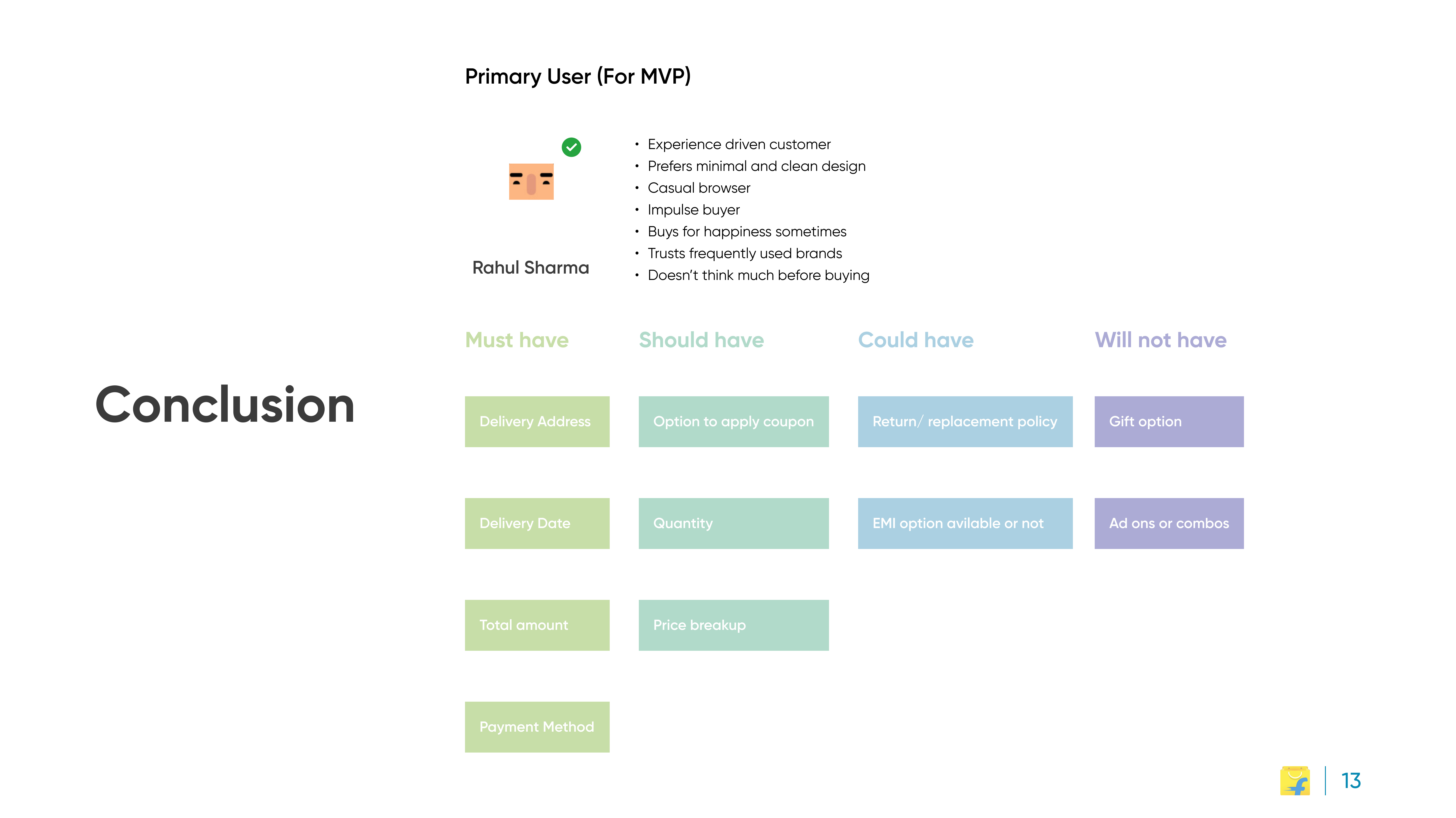
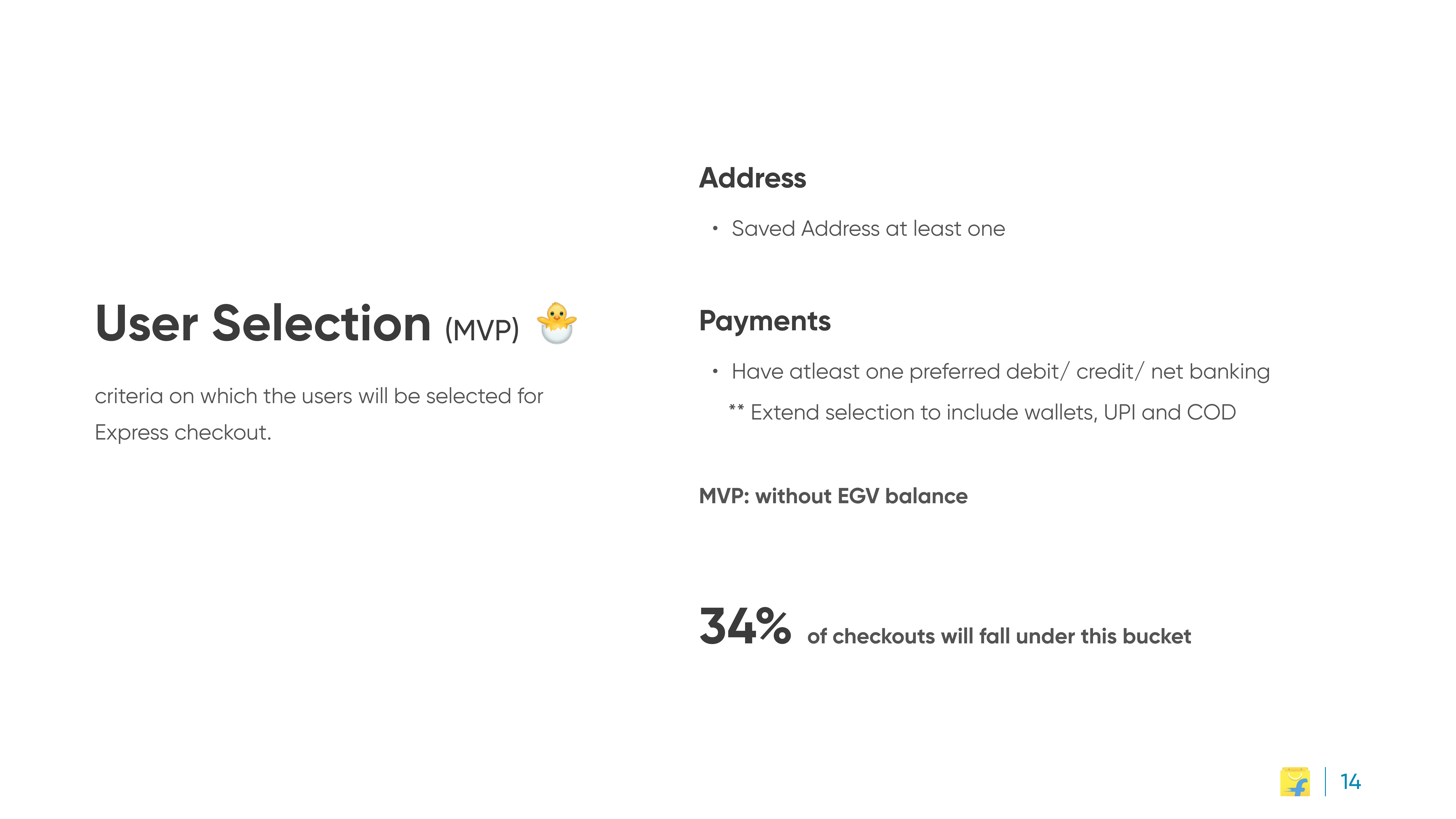
Design for the expert cohort first, saved addresses and advance payment methods, rather than one flow for everyone.
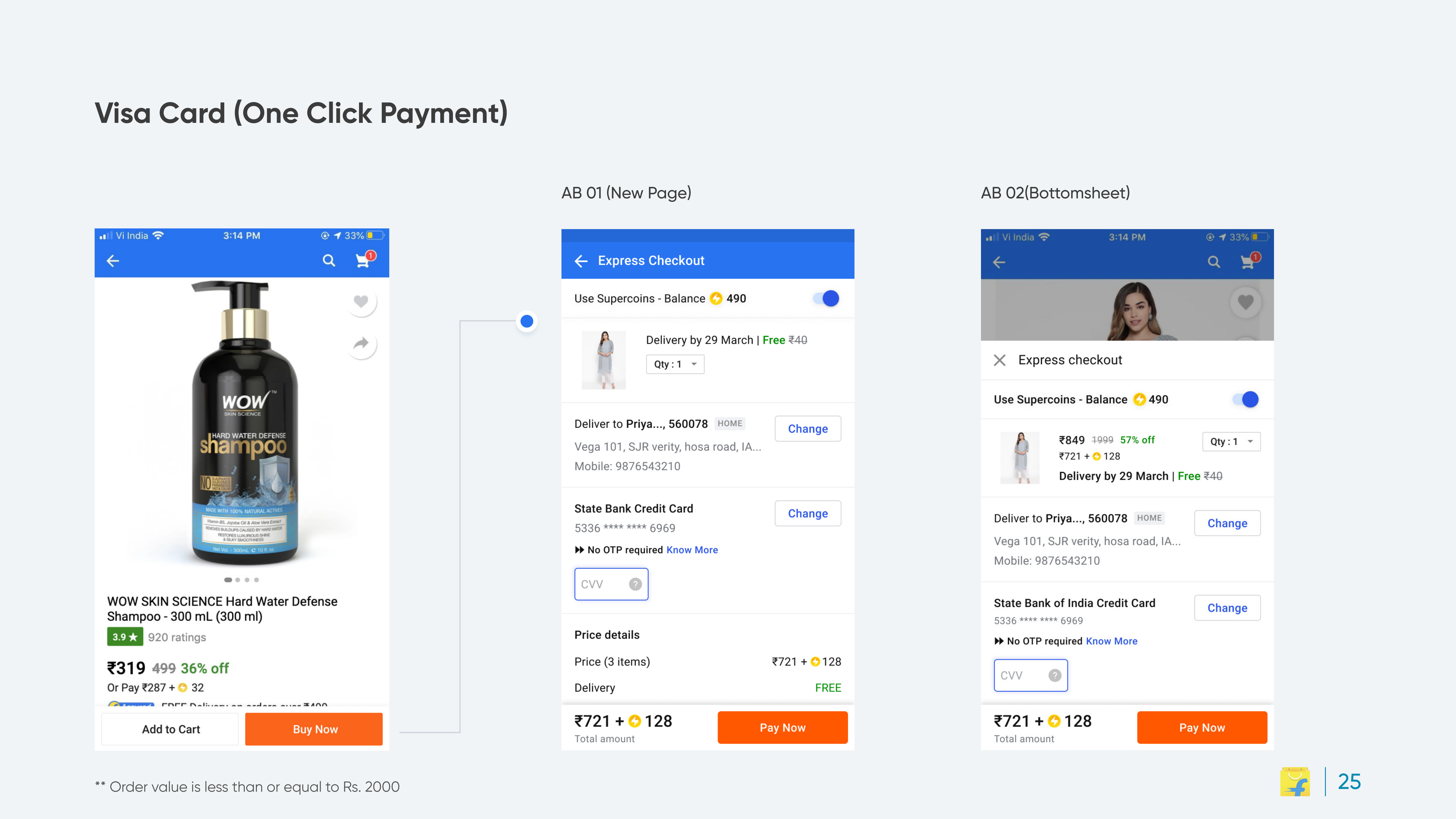
One-click payment paths for stored instruments like saved cards.
Outcome: reduced friction at the funnel's highest-stakes point for the returning-customer cohort. The full case, data, flows, and screens. Is below.